In 2020, we entrusted BUENAVENTURA estudio with the design of the new visual identity of our activity, and thus maximize the reach and the projection of its consolidation. The new corporate image had to reflect our collaborative spirit between designers, architects, interior architects, decorators, and craftsmen as well as the common role that advanced techniques play in our projects.
Who is Mater Metier?
In 2020, we entrusted BUENAVENTURA estudio with the design of the new visual identity of our activity.
The first step was to name the new project, for which we had the invaluable help of Xavier Grau from NOM NAM, an abitual collaborator of BUENAVENTURA. NOM NAM has a long history in the field of name design and gladly took our project.
Nowadays, we are Mater Metier and this post is the presentation of our new site. NOM NAM's dexterity offers an innovative use of multiple languages which, like a ditty, reflects our international will and defines us under a phonetically lucky and appealing name. Mother Profession, Material Work, the importance of know-how: these are a concept that represent some of our values such as respect for traditions and the search for modernity. The proximity of the two terms makes them easy to remember and makes their graphics easier.
BUENAVENTURA estudio collaborated with the disruptive and contemporary style of designer @cienfuegos for the design of our image. The various applications of Mater Metier’s branding seek to show our adaptability as an organization and translate into images and scenes filled with identity, concept, and message. Information is structured in a changing way under generous texts and simple and clear hierarchies. The result is a constantly changing medium that adapts to each application.
The corporate identity allows the modification of certain elements that convey different ideas according to the manufacturing departments they illustrate. This is accomplished by connecting the brand image with the identity of each project and department in our organization.
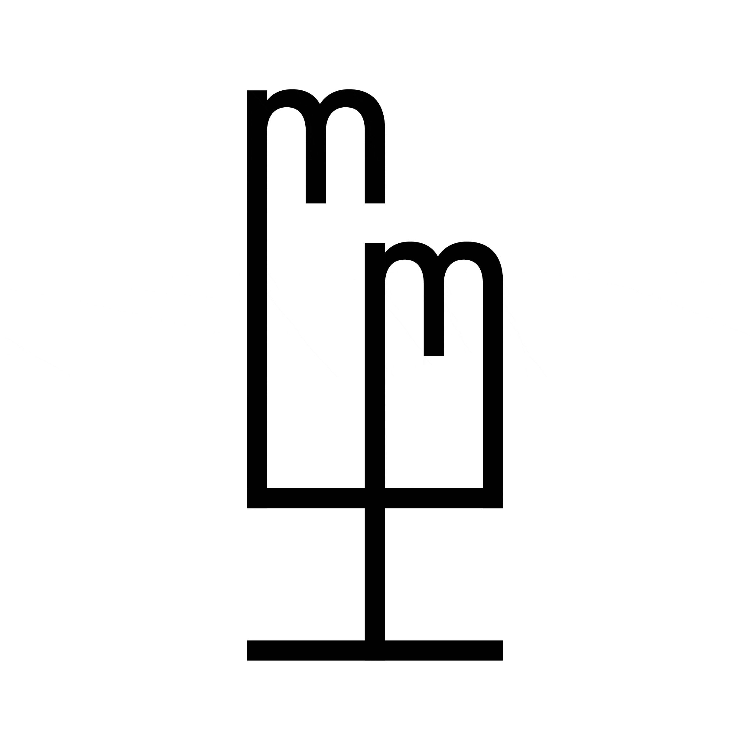
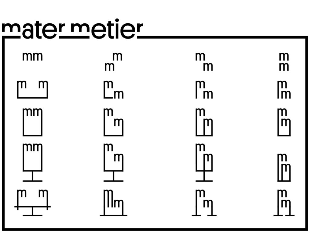
The logo articulates all the graphics: it is the starting point for the ideas represented by the lines that structure the final design. By maintaining the stroke size of the letters in the logo, the lines are used to define each custom piece and, around them, the graphics adapt to each format and each communication need at the moment. The proposed system allows to play with it in different ways and converts it into a living, changeable, and flexible element, A logo ready to adapt to all kinds of situations, like each project by Mater Metier does.
We are constantly reinventing ourselves, subscribe to our newsletter here.
